Well, 2012 saw
a slow start for The Human Canvas.
I actually had to wait 5 or 6 days into the new year.
We went to a conference.
Seattle.
Whatcha see below
is the closest thing we had to a clear sky.
So...I did what I was hoping to do.

Yup.

I mean...we DID plenty.
The space needle, Pike Place Market,
A great bookstore and a couple of great used
cd and record shops. Even an evening of great jazz.
And...
Of course...
...another installment in The Human Canvas!

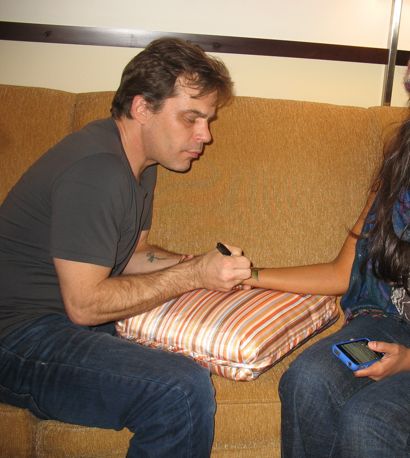
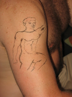
This was on a new friend, Maya.
She and I had talked about a lotus flower.
What I ended UP doing...eh? Not so lotus flowery? But...whatever. She liked the drawing I had done on
paper a few minutes before, and we went with THAT.
A BIT lotus flowery, but really...Continuing this
recently begun experiment involving
the blending of colors - still,
staying with Sharpies.

I tell ya...while rubbing alcohol works best...

An alcohol-based body spray WILL do the trick...


...but it WILL make
the room smell funny. Not "funny ha-ha"
OR "funny strange", but rather - "funny in the
cheap, bought at Walgreen's only minutes before 'cause
it was alcohol based and you really didn't KNOW that it
would smell like that but you can't bring your rubbing
alcohol on the airplane 'cause it's more than the
allowed number of ounces and even putting it
into a smaller bottle looks suspicious at the
security checkpoints thank you 911 but at
least they WILL let you by with 30-50
sharpies" kinda way.
I don't know if YOU ever go through that, but I do.

Thankfully, when you get
tired of the "essence of Spring rain" or whatEVER
they thought they were capturing...
...an old marker will do the trick...kinda.

Here's the funniest part. While I was drawing,
she was texting to her husband:
A: Whatcha doin', love?
B: Getting a tat.
A: Whaaaaaa?
B: A tattoo.
A: I KNOW what a tat is.
(pause, pause...)
A: Really?
A: Are you there?

The conversation went for just a bit.
She enjoyed this so much that it was hard to go
back in with some definition...

...while she was laughing.

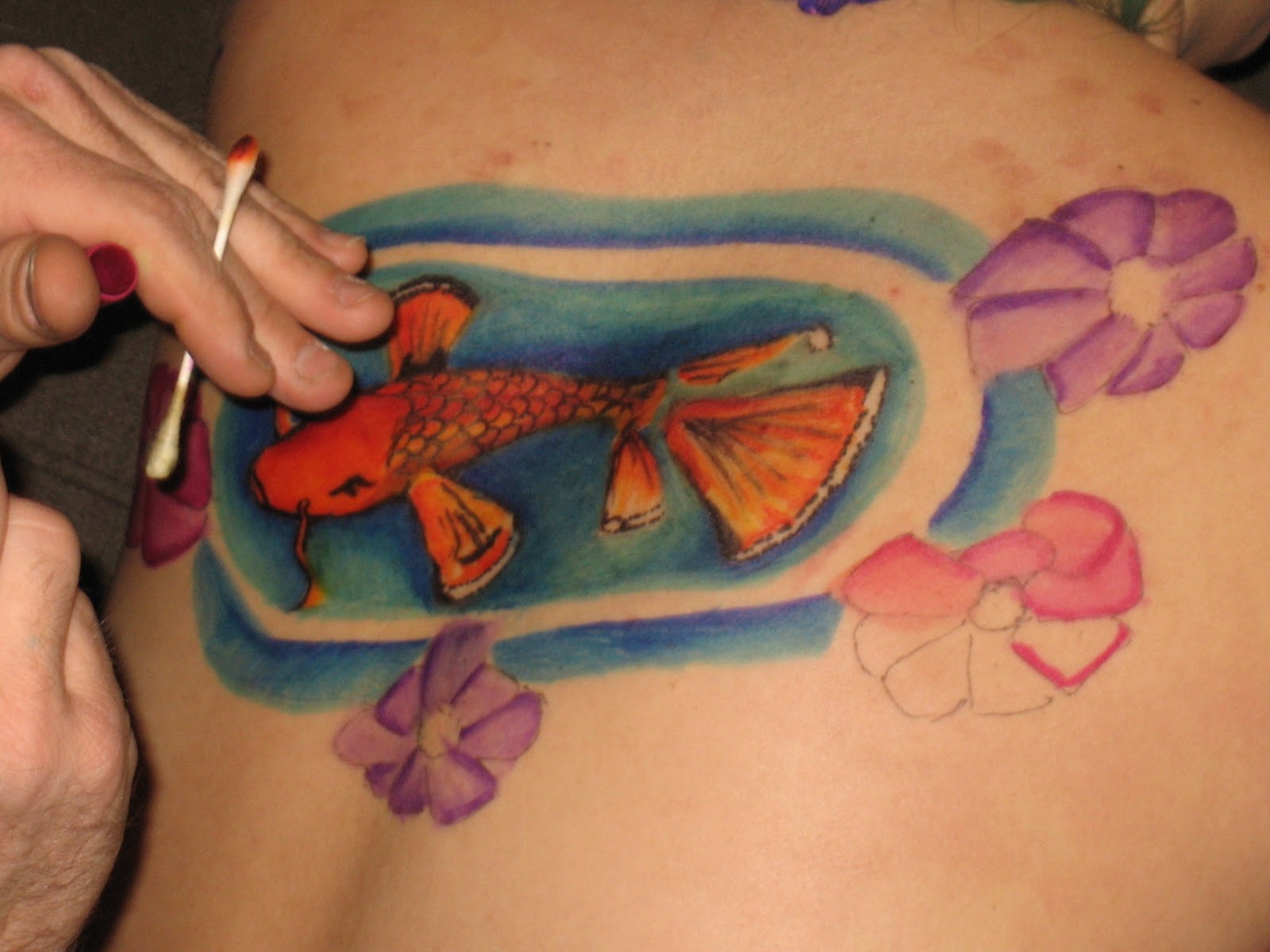
I THOUGHT I was done...
until I decided that it looked a bit like a colorful stingray.

So...I dunno...adding
a couple of leaves to make it a bit less stingray-ish?

The final shot was
something I didn't use for the blog - despite
the fact that it was quite nice. She's a bit bashful
occasionally and I'm respecting
her wishes.
She sent me the below pic to kinda make up for it.
She thought it funny.

I found it hilarious! Almost lost my coffee when I saw it!
Thank you Maya!
This was the first session of 2012.
The house sitter was set to be next, but
this happened first. I was talking with a friend
about HER next Human Canvas session. I thought
we'd also talked about a lotus flower. Oops...wrong Julie.
This Julie was a landscape coversation. The other
was a Katy. Anyway, this in mind,
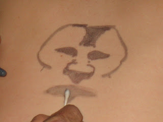
I was cleaning the garage...
...and found a brown Sharpie.
Four quick lines and smears later,
I got somethin' going that WILL be applied
on a larger scale.

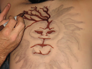
I DID discover though,
that if ya gonna add trees after the fact, it
doesn't QUITE work as well as the Bob Ross oils.
Not in overlaying onto darker areas anyway. Bob's
stuff is a "wet on wet" method, working dark to
light. I think the better picture is above...
BEFORE I added those two trees.

And as it fades...

...it becomes a rose floating in front...

...and then just a rose
sittin' on top of some 3-day old Sharpie.
So...meet Lydia. You've seen her on these pages before,
but we'll get back to that in a second.
I really debated on
whether or not to start this next entry
with this particular photograph (or another
one very much like it). It wasn't so much a photo
to capture this whole step-by-step thing. It was just
playful, fun (this IS Lydia), flexing in the mirror
while taking a brief break during
this Human Canvas session.
I was hesitant...only at first...

...Until I got online
late that night and saw that when
she had gotten home, she had already gotten
in front of the mirror...
...and posted this next pic.

(((This was part of her bad-ass, tatted-up look
in prep for some motorcycle classes the next day)))
You might've seen Lydia in
an earlier Human Canvas session called
The Bra Strap. In that session, I was going to
have a woman, shirtless, covering her
breasts with her hands, with
the bra straps drawn
back in.
We were tired
and (more consequential to THIS project) out of ink,
so this is as far as we got.

Then she moved away.
I don't think this was any kinda cause and effect.
Hopefully we'll be finishing this soon.
I have more ink!
It was just shy of 2 1/2 years later when she moved back to town...January 17th.
So...January 18th...
...we started another session.

While she'd been away
she'd done some RATHER interesting
things. She flew to South Africa for an interview
with Desmond Tutu, some documentary work,
AND did some shark-diving
and photography.
You know...everyday, ordinary things like that.
I had never attempted to draw a shark before.
I had also never attempted to draw Desmond Tutu.
For this session I went with the shark.

She was a bit partial to the blacktip variety...

...and I must say,
It IS a rather attractive fish.
I WILL admit to having looked AT an image
of a shark while doing this...trying to
get the dimensions right.

I (we) were happy with the results,
and I'm sure it turned out better than if I'd been
trying to draw Desmond Tutu!

I was REALLY anxious
to try out a (yet another) new
blending technique, but all of my dark blue
pens had dried up. MAN, did I bitch! Oh well.
On then to that reef (-ish looking thing).

And finish it off with just a bit of black for
just a wee bit of detail.

After putting away the markers,
I found one of those dark blue pens I had been
bemoaning just 10 minutes earlier. And then another.
Good thing.
They came in REALLY handy
for the next session - quite possibly the most
outstanding piece to date - the next night with Shaelyn.
Meantime...done with this session...
back to just hanging out...

...and catching up with
an old friend who I'm SO glad moved
back to the area. Though really - ANYwhere
woulda been closer than
South Africa...

...while occasionally
sneaking in another picture or two.

But really - I HAD to
close out by going back to this'n below.

It's just TOO cute! AND fun!
AND, seeing this (unexpected) photo
REALLY cracked me up!
Thank you Lydia.
The next session was with the house sitter.
I've grown to call her Shaelyn. This was the next
night. Shaelyn came over with a specific image in mind.

An idea for a future tattoo.
Mayyyyybe.

This is about what it
would be...just about where it would be.

I wasn't initially gonna
include the above photo, but it
kinda looks like I colored in her eyes with
the same marker, doesn't it?
NOT recommended.
Okay. Back to the drawing(s).

Shaelyn's a cool,
art-minded person, and
we chatted about the process as we went.
I was telling her about a type of blending that I'd
be playing with that evening - she stuck out her arm to
serve as a blank slate for a demo, as I
explained how I'd be melding these
two shades of blue.
art-minded person, and
we chatted about the process as we went.
I was telling her about a type of blending that I'd
be playing with that evening - she stuck out her arm to
serve as a blank slate for a demo, as I
explained how I'd be melding these
two shades of blue.
The demo tuned into a bonus piece for the evening.

But again...back to the drawing(s).
A quick, quick background, with just a touch of that blending technique on both the seahorse and the background...

...and done...

...Well, done with the seahorse anyway.
Now...time to PLAY!

Making marks with the orange,
then drawing it out (as it were) with a yellow.

Some detail with a fine line...

...Then something heavier...


...And,
Remembering that as the background gets colored in...
...her skin will show up AS another color...

...So extend those fins and the tail with just a series of dots...
...which gives a nice white stripe, and just a bit of a looser, frayed edge.

(((Okay. Same moment - different angle. She was actually prepping for class during a great
deal of this session. But...again...back to the drawing(s).)))


Some scales and detail later - time to start
playing with that blend again.

Really - just a series of marks with any dark tone...

...pulled and spread with a lighter tone.


Now going back to another method...


...A series of rough, fine line sketches...

...Blending the color this time
with alcohol and a swab, an experiment I first

Just a different type of smear,
with a different tool. I'm sure a garden rake
would give a different look
as well...


...But wouldn't feel too good.

The leaves...a dark green mark - pulled down
and out with a lighter marker.


A bit more dark green again to give a varied tone...

...And some black for definition.
JUST a bit. NOT going overboard.
JUST enough for some depth.

Look close...over and over...

...And I think we're done.

Oops. Except for a signature.


Again. Done.
Oh yeah.
And I couldn't resist....
...Drawn and Quartered.

Get it?
Oy.
Shaelyn made it clear,
not only HOW close she lives,
but that if these only last a few days...
"...we can go at it again in - what - 5 days or so?"
"Excellent."
Truly appreciated.
It was a great sitting...and there are
more with her to follow.
It's March, by now,
and the next session was back to Lydia.
Well, not so much BACK to her, but rather...on her belly.
We did a back-piece the next day.
The first one finally ended up being called The Belly of the Dragon!


Then play with the light...


I've
been working


I have to admit -
I thought of attempting this design
after seeing something similar on a shirt O' mine.


Now even though this IS an image


second album, Hydra.


There we go. So...


It was also
a Fall Festival of some
sort,


more with her to follow.
It's March, by now,
and the next session was back to Lydia.
Well, not so much BACK to her, but rather...on her belly.
We did a back-piece the next day.
The first one finally ended up being called The Belly of the Dragon!

Or the dragon on the belly?
Or perhaps Bilbo Baggins and the Belly Button?
No...hang on...

While Bilbo Baggins and the Belly Button
may work well playin' with a buncha B's for a catchy
title, it doesn't QUITE work for this.

For THIS little fella
crawling out of Lydia's belly
button (naval maneuvers?) to be Bilbo Baggins,
it would imply that the dragon is Smaug. Problem
is that Smaug wasn't so serpantine, but rather
the four-legged, winged kind. So it's
not Smaug, and therefore
not Bilbo...

...Just a fun picture on a previously unused canvas.
AND - her ribs and pelvic bones created a wonderful frame!


Two different cameras
used this night gave us different lighting.


Okay...Back to the other camera.
After deciding that "Bilbo" would be crawling
out of Lydia's belly button, we started joking about
other drawings like this...

...Except he would instead be popping out of cleavage.
He could also be emerging from an underarm,
or out of a waistline...who knows?
We'll see if any of that actually transpires.

For now...done.

Next day - QUITE faded after sleeping...but no matter.

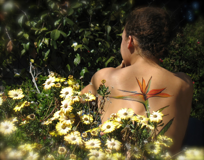
At that point we were
about to start something REALLY cool
involving a bird of paradise, & the plants outside.
Also referred to
by its genus, strelitzia (thank you Andre).
by its genus, strelitzia (thank you Andre).
Native to South Africa, it's commonly known as
a "crane flower" (thank you Wikipedia).
a "crane flower" (thank you Wikipedia).
While native to South Africa,
it thrives all around the world. As do African
daisies (genus...somethin' else). Like here -
it thrives all around the world. As do African
daisies (genus...somethin' else). Like here -
in Redlands, California.

But back to the bird. Bird to the back?
Back to the beginning?
AH!
The beginning of the back!
Okay. I was gonna start
with a shot of the blank canvas, then do
the whole step by step accompanying narrative thing.
with a shot of the blank canvas, then do
the whole step by step accompanying narrative thing.
But we already know what this is gonna be.

Really, simply a continuation
of one of a few blending techniques I picked up
recently, and stacking the pieces,
of one of a few blending techniques I picked up
recently, and stacking the pieces,
one by one.


I REALLY need to find the picture I used for reference.
What you see pictured below actually IS EVER so
close to what was on the photograph.
Man! I need to find that.

So...of course I was trying
to do a good job on the drawing,but
that's not all I had in mind.It was a beautiful day.
to do a good job on the drawing,but
that's not all I had in mind.It was a beautiful day.
Time to go outside...

...amongst the REAL Birds of Paradise.
No more building on the drawing.
Just go into the plants.


...the shadows


and more.

THEN go to the African daisies...

...and do it again.
These multiple shots are
also allowing me to experiment with various
post-effects on close to
the same shot.
also allowing me to experiment with various
post-effects on close to
the same shot.


Of course there WERE things.
I noticed that I really shoulda added more greenery.
More leaves...maybe a second bird?

Next time. Next time.
And I'm still cropping and tweaking.
SOOooo many wonderful shots to work with...
...and choose from.

So check back to the blog entry for this session.
Give it a bookmark. Or do a simple Google search.
The Human Canvas - The Bird of Paradise.
There'll most certainly be updates,
but ALREADY...

...there are some real beauties!
Thank you Lydia.
This next one ended up being called
An Octopus's Garden in the Shade. Maybe An
Octopus's Garden on Shaelyn would be
more appropriate.
But anyway...
The first thing I drew on Shaelyn LAST time I saw her was an idea for a (possible) future tattoo. A seahorse.

Then I (of course) took it further.

But back to THIS session.
The idea was not so much the figures drawn,
but rather take advantage of some of the
natural lines of the body.

So...
start with another
seahorse...


...And slowly work your
way to the right. Blending the blues
works well to add just a bit of depth and variation
to the rest of the water. This, as
opposed to just a simple
wash of ONE color.


Make that seahorsES.

Now here's the first real shot
of that line I was talking about. The line
created between a person's arm, and their
back. This would become, simply, one edge of a
cave. A cave for...


The title character...
(same blend...one dark color - pulled out
with a lighter variation)

An octopus...

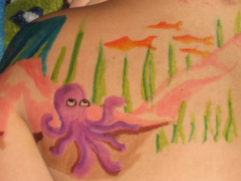
...her garden...


...And now here's some shade.

When it was all said and done,
and they had gone home for the evening,
they got in front of the mirror and started clowning
around - and thankfully got some of the shots
that I had neglected to get.
Unfortunately, while I AM tagged
in those shots, there's some sort of weird e-block
kinda thing going on which prevents me from
snagging them. I'm sure I'll get
around that.
Somehow.

OH!
And did I say THEY?

The next session
started about 10 minutes later.
Shaelyn brought another canvas with her.
I've grown to call HER Sadie. In this case, once again
making use of the line between
the arm and the back.
It begins with
a bit of a landscape -
starting with a couple of mountains on
the shoulder...

...And adding a third to continue onto the back.

Still playing with a
couple of blending techniques,
couple of blending techniques,
though for this piece the blends are applied
not to the main figure of the drawing, but rather what
ends up being the background. Something subtle,
for just a bit of depth and variation.
not to the main figure of the drawing, but rather what
ends up being the background. Something subtle,
for just a bit of depth and variation.
Very recently, several friends
and I have talked about enjoying the "step-by-step"
shots. So - There are quite a few more shots
and I have talked about enjoying the "step-by-step"
shots. So - There are quite a few more shots
here showing that.


Some sky and a stream...

...a meadow,
and the beginning of a waterfall.
Hm. Seems to be a fourth mountain in there
now too.


Then start to add some
rocks over which the water CAN fall.


And get in there with
some black before moving over to the back.


And now this goes from landscape...

...To something else ALL together.


I've played around with
a BIT of an Alice in Wonderland theme before,
but I always forget the rabbit!


And Done!
Except this time it looks like I forgot ALICE!

Like the previous entry,
An Octopus's Garden in the Shade,
There are a few more shots that OUGHT to be
included - shots that I don't have access
to JUST yet. I'll get 'em. So please
check back!

Thank you Sadie...and Shaelyn.
Until the next...
And next, was Lydia.

No stranger to these pages, you've seen her
before in the Human Canvas sessions "The Bra Strap",
"Shark Diving", "The Belly of the Dragon", and
"The Bird of Paradise".
This time,
No stranger to my pens...
A koi.

Kind of a funky looking brand of koi, I must say.

Make that... a couple of funky kinda koi.

Yeah, funky maybe,
But whatever. I kinda like 'em.
And there don't seem to be hard fast rules on
what these things can
look like.

And if you DO KNOW that these are NOT koi...
Fine. Let's just call 'em fish, and move on.

Back then to that blend of blues we used on
Shaelyn, with the session called
"Drawing on Many Lessons".

Matter of fact, this piece
was very similar to "Drawing on Many Lessons"
all the way around.

With the flowers...

And leaves...

And pool of water...
This was intentional. This night was filmed,
so I chose to go with an image I could go forward
with much faster. Something where I'm not trying to
decide what's next AS I go.

The film ended up being a bit shaky...
Probably not usable. It's okay. We knew this going into it.
Plod on then with some detail around the leaves...

The flowers, in and around...

Then just a BIT under the fish...

And then I think we can call it done.


And it made for some really nice photos.

Now under normal circumstance, I've always posted the Human Canvas sessions in the order in which they occured. This one needs to be an exception.

April is National Autism Awareness month.
Pictured above is Lillian Vasquez,
Marketing Coordinator at KVCR. Now,
ANYONE who raises an autistic child will end up
becoming quite knowledgable on the subject.
Lillian takes this a step further.
She's been able to use her very real experience
to suplement further education. She's also been quite
fortunate to have employment at a place which
could also serve as a vehicle for furthering
awareness and education for the
public.
And Thankfully so.
More and more information is being discovered,
and becoming available, regarding the entire autism
spectrum, but I'm afraid that when many people of autism, they think of Dustin Hoffman's character in Rainman.
This character was amongst the most severely autistic,
with some uncanny abilities involving mathematics
and memory. This type of manifestation,
while very real, is not the norm.

KVCR, since Lillian started working there,
has long since been involved with Autism, by way of
broadcast interviews on both radio and TV, and other educational endeavors. Most of this educational outreach
has been available to the general public. As a matter of fact,thanks to the expertise of Lillian, KVCR has been able to produce several DVDs on the subject of autism.
These are still available, and you can find
ordering information
You can link to KVCR's Autism Initiative page HERE,
and HERE for a link to Autism Society Inland Empire.

And the puzzle piece?
From the website, Pinning Down Autism,
"The puzzle piece logo was first created in 1963 by the National Autistic Society. They explain “that the symbol of the Society should be the puzzle as this did not look like any other commercial or charitable one as far as they could discover. The puzzle piece is so effective because it tells us something about autism: our children are handicapped by a puzzling condition; this isolates them from normal human contact and therefore they do not 'fit in'.”
Since then, the interlocking, mutli-colored puzzle piece has become the international symbol of autism. Its significance has become multi-faceted. For some it represents the mystery and complexity of the disorder, for others it represents the mechanical nature of an autistics persons thought process. The bright colors are said to represent hope."
Since then, the interlocking, mutli-colored puzzle piece has become the international symbol of autism. Its significance has become multi-faceted. For some it represents the mystery and complexity of the disorder, for others it represents the mechanical nature of an autistics persons thought process. The bright colors are said to represent hope."
I'd like to also think that a puzzle piece represents a person. And that person is ONE piece... of a MUCH larger picture. Whether or NOT that person falls anywhere in the autism spectrum.
So again,
I regret not getting to do this
session with Lillian until nearly the end of April.
But at least I know now...

...I have a standing date next year.
Thank you Lillian.
For this next one? Well,
I recently decided to cancel my plans
of going to LA to see Val Kilmer in his one-man
Mark Twain show, and instead go a community theatre production of Oscar Wilde's The Importance of Being Earnest. I'm a big val Kilmer AND Mark Twain fan, but
REALLY wanted to see this effort of a friend.
And by the way, some of the best theatre
I've ever seen has been AT the community theatre
level, and one of most BORING shows I've ever seen - was
on Broadway. Now you don't HAVE to be some sort of English lit/theatre geek to enjoy this play (though it don't hurt), but this closing night turned out to be the BEST version of Earnest I've ever seen, or worked on. Yvonne and the cast were able to find humor in places normally glossed over, and make what was already funny - hilarious!

After the show, several of us had an impromptu
gathering. I ended up doing a few Canvases this evening,
for which I was thankful. The above photo is the third piece done this night. It started though, with someone else.
Yvonne - the director of the show. I WAS at their house
after all.
Not too many step-by -step pics on this one.
It was fairly basic. Yvonne was wanting to experiment with a tattoo idea. Some wings on her ankles.

Only a couple layers of color before being done.

The above shot is better I suppose, but I rather like this one with Hendrix standing in the foreground.

On then to the next ankle...

And a stab at another style of wing.

I like where I was going with this one, but I don't feel like
it quite got there. We'll be hitting this again.

So on one of the recent sessions prior to this,
it was Willow - the cat - occupying the attention of the canvas. Remember this? Link to it HERE.

And this time?

Hendrix - the dog - again.

While I enjoyed playing around with the wing idea,
and definitely want to revisit it, I think this next piece ended
up being the best of the night.
Meet Sam.

Sam was a wonderful canvas, as anxious as I was
for another sitting...

And while this session was just one week into April...

Sam's already moved from the area.
So I'm QUITE happy to have gotten this one in.
But I KNOW that San Jacinto area theatre is gonna miss her.

And while there were few step by step
shots on the three previous pieces this evening...
There were NO step by steps on the last piece I'd do.
But it was late. I mean... it - was - LATE. I mean -
There WERE still 8 or so people there. It's not like I was
the guy on the floor drawing on people, keeping everyone from going to bed. more accurately, I was the guy on the floor
drawing on people, keeping everyone from going to
Denny's. It really all worked out well though, as
this got Sean to makin' some mighty fine
breakfast burritos.
MIGHTY fine!
This allowed me to wrap up the last piece,
another first stab at one of Lewis Carroll's characters.
Someday we ARE gonna see a BUNCH of 'em assembled at
the same time. Someday.
Meantime...

Thanks Sam, Yvonne, and - to make the list short -
EVERYONE who was a part of Inland Stage Company's
The Importance of Being Earnest.
Once again - the best take I've seen on this yet!
Bootz.
AKA - Lil' Dave.
We worked together at KVCR at one
point, so I was David - or Dave - and he was
Lil' Dave. Simple
as that.

You've seen him on these pages before.
A long time ago, before he went out to hang with
some friends, he became my first shot (on skin) at
a Lewis Carroll character...

...or two.
Problem was - the
fresh ink on ONE shoulder
made the REAL tattoo on the OTHER
shoulder look kinda washed out.
So, add a quick, quick
border...

And there ya go.
Fly, little bird. Be free.
But back to this night. Dave's REALLY into Spiderman.
He also has an old tattoo that he REALLY wants to cover.

So here's where I come into the picture.
While these explorations into The Human Canvas
have been, and will continue to be, a personal art project,
they also occasionally been a
service of sorts...

Allowing a person to "test the waters", as it were,
when thinking about getting
a tattoo.

In this case...Venom.
In a nutshell, Venom was an alien life form
which became a part of Peter Parker...and Spiderman.
At first, it seemed to be simply a cool new set of
powers acquired in The Secret Wars.
Later Venom was shown to have
certain "Blob-like"
qualities...

Allowing it to sort of drip, splat, and reform as a being.

So tonight we were testing the waters on this idea...

...exploring as we went...

...and coming up with something kinda cool...

...which WILL receive some alterations/adaptations
when we hit this again.

Meantime -
Drip...Splatter...

...Done with this piece...

...and onto the next.

Another piece of Canvas provided
by Lil' Dave.
We had JUST finished covering a
real tattoo, and working
with the shape of the kneecap
for a shot at Venom.
This was a fun experiment which
I know we'll
be revisiting. Already talked about
it...
just haven't sat
DOWN
for it yet.
Another fun
experiment
for me is EVERY time involving
the blending of colors - employing a couple of different
methods.
So it's not so much "Struggling
With the Blues" at this point. Here it's still FUN with the
blues.

And
reddy-oranges.

But the problem with using this
blend
of blues for the
fish...

...Is that it's same blend I
use to get depth
and contrast in the
water.
So... I got a good
fish.
But what to do
with the
water then...

It was a struggle with the
blues.
A STRUGGLE
let me tell ya.

Oh wait. Never
mind.
Just have it coming down INTO
water...
...As if it had just jumped.
Okay. Comfortable with the
blues again.
And making this water was a
wonderful,
organic, create as you
go
kinda
thing.

Except after stepping back, I
decided it needed a pooling effect...

And THEN we're done.
Again.

So...
Michelle.
I'd done a bit of filming for her, and was
rewarded with a canvas to work on. I've known her
for
a while, and I guess I'd been leering long enough,
as
she offered it up before I could
ask.
I was certainly gonna, but she was
quicker on the draw.
As it were.
on a design to connect my wife's
two tattoos into one, so THIS session
was gonna be a treat for me. Michelle
already
had a couple of Chinese characters on her
neck,
and an Egyptian theme running across the top of her
back.

Across the small of her back - a bunch of wonderfully
colored flowers.
I got to fill in the space between.

I had kind of forgotten exactly what her
upper back design was, only a vague shape. So I started
thinking about a Thunder bird.
I told her, and she said that was
something
she'd been thinking about as well.
So it was settled.

Well, it WAS settled.
Then I started worrying about mixing a
Native American piece in with
the others.


I finally decided that with
Chinese, Egyptian, and the flowers
(which I felt had a Polynesian feel), I was safe
to venture into yet another culture. Mixing and
matching on Michelle would work out fine.
Besides, a
thunder bird would go with the rest in other
ways, mirroring in shape...


...And in color as well.
Now it's just a matter of playing with
those smears and blends. And there are extra
photos on this session for the whole step-by step
thing.
It makes for a decent
slideshow.


A little blurred and outside the edges... but
that truly doesn't matter - straying slightly outside of your borders. At least
in areas where you're gonna go re-define the edges with black
anyway.

Still though, I have a few ideas on how to
control the smear/blend just a bit.
That'll come soon.

Meantime...
A cotton swab does the trick.
Nicely. A tip though. Buy generic.
Beyond generic. Buy something really really cheap.
Q-Tips have a wonderful, full, fluffy tip - great
for what they're actually
MADE for...

But when ya dip 'em in alcohol and drag 'em across the
skin, they start to spread out... sometimes giving less of a smear/blend, and
more of a general wash...

...That you have to
disguise with a buncha little
circles.
Oh well. Looks good. Works well for that type
of art.
Ya don't make mistakes. You make happy
little discoveries.


Now the thing with
Sharpies,
is that upon application, they
WILL stand out
from a real tattoo. No matter
how good (or not) the
Sharpie drawing may be. The
trick to avoiding this - is powdering it. Just like if you had just put
on
makeup, and were
trying
to avoid
shine.

Um, I
didn't have any.
Michelle asked, "Do you have any corn
starch?"
Now
that I reflect back on this day, I wonder if she might
have
been kidding. Didn't matter at that point.
BOOM! I
was OFF
to the
kitchen.

Um, I didn't have any corn
starch either.
All I could find was
some instant gravy
kinda
thickener kinda
powder
kinda
stuff.

Being the person
who suggested
corn starch in the first place, Michelle was
okay with this being sprinkled on her. And the
stuff spreads okay, but doesn't do too much for taking off that
shine.

It just sorta sweeps off,
leaving
white powder along the edges of your
backdrop.
So - this thunderbird remained a bit more
vivid
than the other tattoos..

Now the thing is, even without
washing,
these things will fade slowly anyway. Well,
technically
speaking, they're not actually fading, but
rather,
the skin is slowly flaking away. So the next
day,
these things are always muted, having
the
vibrancy of something more
akin to a real tattoo.

Problem is, with the fading of
color,
you get a fading of
detail. I always wanted
to go
back into one of these things, the day
after,
but never pursued the chance.
Until now.
I had mentioned that this session would be a treat for
me.
The next day was even better.
So - this next shot is what it looked like after a
night of sleep - some of it onto a black t-shirt, some
onto the sheets - fair warning
having been given.

So with just a quick touch-up of the purple...

...And the red and yellow wing-tips,
and that's pretty much matched up with the
vibrancy of the original tattoos. At least for a zoomed
out shot like this one.

Problem is - with the fading of color,
you also get degradation of detail. And when
you go in with the black to replace it, the color is
once again too bold to match up with the
original tattoos - which was part of
the POINT of this session.

But there IS a way around that. We'll address that shortly.

Meantime, in addition to the Thunder bird,
she was game for letting me add a
drawn flower to the
tattooed ones.

Well, three.

Okay - Six.

Now once again, while the flowers
turned OUT well, they were - like the Thunder bird -
now more bold than the
real tattoos.

but ya take this, and ya powder it down...
(ordinary setting powder)

And everything now has the same TONE,
And ready for a few nice shots.

Only thing - a couple lines on the
Thunder bird ended up crooked. There was
SOMEthing keeping me from straightening them,
without the line getting thicker
and thicker.
Also, I coulda extended some of the
dark lines of the drawn flowers into the areas
of the tattooed ones.
Just a bit.

It's okay though. We were both
quite happy with the results of this
session - and there'll be another in the future.
This is one of several in the works that have to do with adaptation with a real tattoo.

But I also had to dash.
Believe it or not, I had another session
lined up for that night (which turned out to be two)
and so I ran off after finishing this bemoaning
that I wasn't allowing myself just
another 20 minutes (or so).
But what I ran off to do
became something REALLY cool...
A successful experiment.

I know.
I keep on referring to these
Human Canvas sessions as some sort of "experiment".
Truth be told, each session usually IS an
experiment... trying some new image
or method... or both.
This one started...
with me talking to a woman about
doing a session with her, and she mentioned
that her daughter was thinking about a tattoo
(okay, more like really really really wanting one),
and this might be a good way to
"test the waters".

We didn't talk about it before I came over.
I just knew Lexi wanted a lion, and thought this might
be a cool approach.
LOTS of step by step shots on this one.
It's a cool slideshow, if ya have that option.

Starting with a quick line drawing...

Only to smear it out,
making it more of a general wash.
Later this'll become a mere suggestion of a shadow.

At this point though, it'll let me lay down the image...
without having to be precise.


Okay.
That done, let's go in with
one color to start to find a lion within the
rough marks I laid down.


I have to admit -
I thought of attempting this design
after seeing something similar on a shirt O' mine.

But it's only similar.
There's no WAY I coulda recreated that.
Besides, this soon lent itself SO well to having
a flowing, "see what happens as we go" kinda thing.
Organic, if you will.


Now add another color for some highlights,
as well as a bit of further definition. THIS blue,
while it works well aesthetically, I picked this shade soley because it's amongst her favorite colors.

At least...
that's what her Mom said.
Lexi's back was to me the whole time.


And here we are! Turned out nicely.

All it really IS though...
Is a general wash with one color...
Followed by two colors. The first to draw,
the second to accent (which allows you to "correct").

Thank you Alexis,
thank you Christie, thank you Sierra (who was next)
and a big thanks once again to Mike Munoz - photographer
for the evening.

So...meet Sierra.

For her, by request, I went with one
of this years best - first done on Shaelyn...

...Then repeated, to a certain extent, on Lydia.

I've done before, each one remains
unique - to a certain
extent.
We start with a koi. Well, a smear, anyway.
One color, pulled and spread with another SOMEWHERE
in the same family...


Now that the smear's become a koi, add some scales...


And then some water,
using the same blending technique.


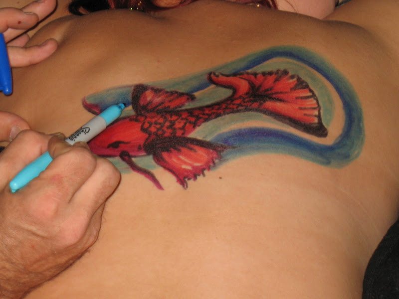


A few flowers and leaves later...

...As well as wrapping up whatever show she was
watching on her phone...


And we're done!

Thanks Sierra.
This was a bonus for the evening.
Thanks also to Lexi, done just before this'n,
and thanks to Christy as well, for wrangling these
couple of canvases for me.
And thanks again to Mike Munoz - photographer for this evening.
One more thanks... and that's to YOU. For looking, for spreading the word, AND for being next.
So for the next sessions...

I was recently at a really
cool music event in Yucaipa, California...
Rock Autism - presented by the Autism Society - Inland Empire.

Some great music...

...And vendors...

And I got to hang out at the KVCR booth,
drawing puzzle pieces on people for a donation of any
amount to The Autism Society - Inland Empire.
First Priya...

um... Priya.

Then Alyssa, who was there representing KVCR.

She found it painful!

Well, maybe not.

From the website, Pinning Down Autism:
The puzzle piece logo was first created in 1963 by the National Autistic Society. They explain “that the symbol of the Society should be the puzzle, as this did not look like any other commercial or charitable one as far as they could discover. The puzzle piece is so effective because it tells us something about autism: our children are handicapped by a puzzling condition; this isolates them from normal human contact and therefore they do not 'fit in'.”
Since then, the interlocking, mutli-colored puzzle piece has become the international symbol of autism. Its significance has become multi-faceted. For some it represents the mystery and complexity of the disorder, for others it represents the mechanical nature of an autistics persons thought process. The bright colors are said to represent hope.
Since then, the interlocking, mutli-colored puzzle piece has become the international symbol of autism. Its significance has become multi-faceted. For some it represents the mystery and complexity of the disorder, for others it represents the mechanical nature of an autistics persons thought process. The bright colors are said to represent hope.

There were a few kids who wanted a piece done...

...Including one who had been waiting around until I got
back from wandering the site.

While it was (mostly) only puzzle pieces done that day, on many of the pieces, I found myself (unconciously) color coordinating with what they were wearing...


Or in this case,
coordinating with what was already tattooed.
She already had the four primary-colored puzzle pieces.
I provided the red and green ones.

This next wandering festival-goer got a piece to
match her clothing...


...Then it was back to Alyssa for a Sharpie
color-blending demo. I was talking with a KVCR friend
who was curious about "this whole
Sharpie thing I do."


Some of the coordinators for the event didn't
escape getting Sharpied.


Above and below, Theresa McFarland - on the board of directors, Autism Society - inland empire...

Along with Beth Burt -
President, Autism Society - Inland Empire


They each got something to go with their shirt.
Then, in between other festival-goers,
back to Alyssa.

(Below, a nice happenstance with the shadows)


Believe me - she woulda been COVERED
if I'd had my way. She was actually prepared to be
covered, too. Well, I missed THAT boat,
didn't I?
Next time maybe?
On then to other patrons, volunteers, and wanderers.


I'll close with the shot I opened with.
Possibly the coolest that day, and (oddly enough)
something I hadn't considered doing. Interlocking
some pieces that is.

Thanks to ALL involved!
Again, each one of these pieces was done for a
financial contribution (again, of ANY amount) to the
Autism Society, Inland Empire. I had a LOT of fun
hanging out doing this, and I've run into
people since then who had fun as well.
Even a guy who got out of his
car (while blocking me in) to come over and shake
my hand when he recognized me
from the event.
FUN!
For the next session, Meet Ralphyy.
And that's NOT a
typo.

A koi has become kinda quick by
now...
Still
though...

I DO like to get the
step-by-step shots.

This'n turned out well, and it's
a cool process...

Which makes for a cool
slideshow, if yer so equipped.

So...
Meet Ralphyy Bardoux, guitarist
with
Dead End
Gypsies.

I'd gone to
see Cam
Loves LLND
at The Wire in Upland
California. When Ralphyy
walked into the venue, dark as
it was, I thought Vinnie
Vincent was walking up to the
stage to sat hi to Cam.
It was DARK, okay? And
out here, you really, truly, DON'T know who's gonna walk into ANY
club.

It was a cool night,
with Cam's band being the best
of the evening. Original
material (I do believe)
throughout their set. Rounding out the group,
Tommy Lopez on drums,
and brothers
Adam and Ryan V, on lead guitar
and bass, respectively.
I'd totally go see these guys
again.
AND - I truly appreciate being
invited to the
after-party. This is where the Human
Canvas
session with Ralphyy took
place. I one more canvas
that night.

Unfortunately,
this is the only photo from that
one.
I think I kinda petered out on the mid-section,
toward the tail. I DO however like the color blend
on the TIP of the tail. I also quite
like the head,
and the little burst of fire.
Oh well. Ever learning.
I DID crank out a REALLY nice dragon
on a friend a few weeks later.
We'll get to that.
Soon.
Next up... Katie.
About a year (or so) prior to this,
Katie had said that if she ever got a tattoo
(or if I ever laid my pens on her - I don't remember which)
About a year (or so) prior to this,
Katie had said that if she ever got a tattoo
(or if I ever laid my pens on her - I don't remember which)
it would be a lotus flower. Then one night -
at the Vault, in Redlands...
It was Katie's birthday.
I reminded her.


It went
(fairly) quickly.

The next shot is called
"Pretty Pretty Priya Pointing to Pretty Pretty
Petals".


Thank you Katie.

Next that night... Andrew!
I don't recall if it was he that showed me,
or if it
was the other women at the table (not drawn on),
but SOMEONE got his
sleave up...

...and it
was collectively decided that this
real
tattoo needed an update. I also don't recall
if he was a Guns n' Roses
fan...

...But after giving some color back to that
rose...

...The rest, while impromptu, fell into
place.


And then
we got Slash!

At the
Vault!

In Redlands!

Sorta.
I think I wanna
do this'n again, except add some
crossed pistols underneath. Until then...

...Thanks again Andrew... AND
Katie...
Canvases for this evening.
By now we're approaching late May.
Liz. Remember her?

I did a kind of randomesque
piece on her in the middle of a disco at
a Dr. Who convention a couple
of years ago in LA.


Well, two pieces I guess - if you count both
arms.
That's her hubby, Vasilios, standing in the background.
He was the one providing music for the disco.
This was a fun, fun night!
But back to THIS night. Again - a fun one.
I hadn't seen Vasilios OR Liz... or most of the other
folks there that evening in
quite some time.
So...
We got Liz...
and St. George and the Dragon!

(((I'm
having trouble flipping this picture. I have NO idea why!)))
Legend has it that St. George happened
upon a road which went through an area where
people appeased a local dragon with a couple of sheep
per day, serving as a sort of "protection
fee".
Much like what hoodlums may demand
of a small store owner.

Anyway, St. George had been asked to
stay OFF this road, but he vowed to remain.
While in conversation with a local princess, the dragon
reared out of the lake, St. George showed the sign of
the
cross, wounded the dragon, then fitted it with
the girdle of the princess,
afterwhich the
dragon followed her around
as gently as a pet.

But then later, he killed it anyway because
the
local
peasants were frightened.
peasants were frightened.

Or something like that.

St George and the Dragon
is ALSO a really cool number
on Toto's
second album, Hydra.
They've kept with the sword
motiff for many
of their last 30ish years... 
...And this may be the REAL reason
for me
naming this session as I
did.
Although with swords of this type generally having a
cross-shape, it seemed to fit.
St. George and the Dragon...

...and Liz!

Another shot with bigger contrast...

...And another with a bigger
smile.

nOW INTO jUNE, MEET mIKE.
oOPS - dAMNED CAPS LOCK.
There we go. So...
Meet Mike.

Mike had shown me
some pictures of his
dorm, which
included
something REALLY cool that he had created.
We'll get to that in a bit.
Meantime - the photos he showed me...
and the story he told...

That's what led to this session - with
something quite specific in mind. I told him about
it.
He was up for it.
It started with a bit of a wash - just a
smear of some color for use in the
background.

A long time ago,
this smear was the UNsuccessful
attempt at erasing. Now it's become another
method for me to employ. Something
I tried out just earlier this year.
To do this...

...Which became this...

...And finally - this.

THIS - was a COOL experiment.
But back to Mike.

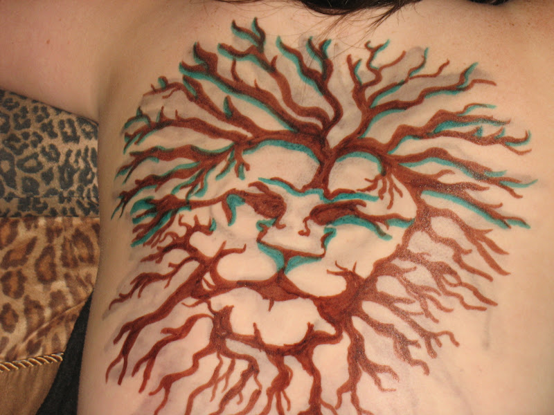
After the wash, we start
with a bit of a "Tree of Life" kinda
picure.


Then we go back in with another wash.
This one ends up being simply a light green
at
the
base of the tree. The important thing though
is that it remains more subtle - allowing
the tree to be just a BIT
more bold.

After that...
Have the earth crumbling away beneath
it.


A bit more detail...

...And now let's talk
about those pictures from his
dorm.
This wonderful tree you see
in the picture below was done with Sharpie,
and created over a long period of time. If you were
able to look close, you MIGHT see that this tree is
made
up entirely of writing.

You'd have to look REALLY close.
He did the writing as a rather personal journal,
and kept it rather hard to read. It was something
public,
yet hidden. A retrospective AND existential
examination...
AND a wonderful art project.

But since this writing/drawing of
the
tree in his dorm was a rather cathartic release for
him...

...I wanted that earth crumbling
away beneath the "Tree of Life" to end up in a
pool.
A cooling, calming place...

A place to find some peace...

...A place for re-birth.

Thanks Mike.
Thanks for the canvas... and the story and pictures
which inspired it.
Oh! Yeah!
This was later that same night.
And no matter WHAT I had in mind
artistically, my wife was there saying, "Draw Aquaman. Draw Aquaman.
Draw Aquaman..." - something like that.

Mike's a swimmer.

So...


Aquaman...

And Mike...

And the mirror.

Thanks again Mike.
Now at the beginning of July,
this session was such a long time
coming!
It was to be called, "So, Why DO
Hummingbirds Hum?"

I did a session
with Erin SEVERAL years ago.
It was in Los Angeles in the middle of a disco
at a Dr. Who convention. A kind of random, impromptu
black and white.

Then, before we could do any more...
She moved! She seems happy - other than me
not being able to draw on her. So the following
session took place in
Colorado.
No major stories behind this one,
just a picturse we both liked.
The blank slate...

With a few quick lines...

Just a TOUCH of color - smeared JUST a
bit...

A few more colors and some black
later...

And there's our Hummingbird.

Now - a place FOR it.


A BIT of black along a few
edges...

And then it's time to play with some nice
photos.


Thank you Erin!
Been waiting for this'n.
OH! And I nearly forgot.
Why do Hummingbirds hum?
It's 'cause they don't know the words.
Oy!
The next session
is dedicated to the land of diversity.
We're now at July 4th.
Marshall, Will and Holly...
On a routine expedition - met the greatest
earthquake ever known. High on the rapids, it struck
their tiny raft, and plunged them down
a thousand feet below...
To the Land of the Lost. To the Land of the Lost.
To the Land of the
Lost-ost-ost...
Wait a minute.
This was supposed to be the Land of
Diversity.
This was our second year in the 4th of July parade
in Lyons, Colorado - population MAYBE 86 or so. In the
picture below, you can see MOST of the town.
The parade is SO small, it circles around
town TWICE so it'll last longer...
maybe seem a bit
bigger.
The Moscow army used to look like that.This is what we ended up lookin'
like.

This... is how it started.
We were gonna each represent a state.
Easy enough.

Tracy was West Virginia...

Though this second
bit of Sharpie makes me think more of
Texas.

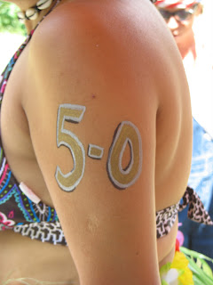
Texas, by Gawd.

Add to it - Priya...Hawaii...

5-0...

Hawaii 5-0!

Even Lola got sharpied.
She was one prairie state or another.
She INSISTED she was NOT Laura Ingalls.
Rather, she was the girl on one of her books in the
Little House on the Prairie
series.
Sometimes it's easier to not
argue.

Tim here MAY have been representing Colorado.
He wore some snowboarding
goggles.

So these were just
some quick, fun pieces to get into the spirit
of
whatever we were dressin' up
as.

After the parade,
back to Tim, Tracy and Lola's - aka Colorado,
West
Virgina, and NOT Laura Ingalls
prairie girl.
Time for a cookout...
And, of course, a couple more
canvases.

Laura's ankle had been waiting to be a
canvas...

Which looked better in the
sunlight.

Her son, Charlie, also wanted a piece.
He wanted a Grim Reaper. Except purple instead of
black.
And holding a trident instead of a scythe.
I'll do a better version of
this someday.

The final canvas of the day (still on July 4th here)...
Melissa.
I'm normally bad with names,
but she mentioned the Allman Brothers,
to help me remember. Melissa. Or was it Jessica?
Melissa.
I'm posting this on Labor Day.
This, the last piece done on July 4th of this
year.
This is also the last piece SINCE
then.
Good thing Shaelyn's back in
town.

Speaking of whom,
Shaelyn's gotten the only
other seahorses canvased so far.
These ones were something to occupy the
space just this side of that coral ridge - defined
by the edge of her arm.

Then, that coral ridge
became a little cave or archway
for
this octopus...

...To call home.
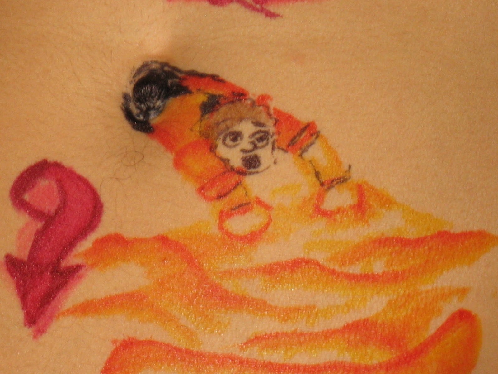
But back to Elizabeth Reed.
Elizabeth? Hang on...
Melissa!
This seahorse was gonna be a bit
different.
So, start with a quick
outline...

And add in some color,
which'll be just a background color,
really.

ONE of the background colors, that
is.

A good time was had by all...

Hey! Look over here!

Thank you. Nice shot.
Back in black then. Wait.
That's AC/DC. This is Allman
Brothers.
Back in WITH SOME black,
then.

Step back - add a TOUCH
more...

A bit of background...

And just a BIT more
black for some definition...

And that's that.

Well, except later in the evening, after a
hike,
one more nice shot.

Jessica? Elizabeth Reed? Eat
a Peach?
Man, that Allman Brothers reference
was SUPPOSED to help me
keep it straight!
Melissa!
Thank you Melissa.
SO nice to have metcha. I don' know where,
but we're GONNA do this
again.
Nearing the end of
September, 2012, I took a trip
to Kentucky to help in celebration of
my parents 50th wedding
anniversary.

I DID make time
for some socializing.
I even organized an event called
"David Fleming is at the Big Apple With Sharpies...
(Again)".
Again?
Well, on New Years Eve 2010 going into 2011,
I was at The Apple enjoying The Mur-Vegas All-Stars -
when I had the opportunity to try out a koi on someone.
Bree. A friend from years past.
At THIS point,
drawing koi was still relatively new for me.
The one pictured above being only the 4th one
ever attempted. This next piece was someone who
I'd just met that night. Someone who took an
interest in this "Human Canvas"
thing of mine.

But back to this day.
Only around a dozen and a half people showed up,
and it was QUITE nice.

They came in waves,
which really allowed me to
visit without ignoring. As one small group,
or person or two, was leaving,
another was showing up.
I was able to visit...
And draw.

One couple of friends who came
by was Vince and Mary Anne Medlock.
I knew I'd be drawing some flowers in the next day
or two, so this is what came to mind. And Mary Anne
didn't care what went onto her arm.
She just wanted to be amongst
the canvases...

...Which I REALLY appreciate
when that happens. On this trip back home,
there was actually one friend who really
REALLY wanted my to draw on her,
but it was SO late when we started
discussing it. I just couldn't.
I'm sorry Vicki.
Really.
But back to
THIS day at the Apple,
That first flower went SO
quickly,
I really needed to put something else with
it.
WHAT else though?

AH!
More flowers!
And I have to admit,
I thought at first that those blue
flowers were, well, "fails" Now though,
I REALLY like the blue(s) contrasting
with the red(s).
Mary Anne and Vince
are friends through a few different ways.
Amongst them, theatre and WKMS.
91.3 FM.
I also added this because
I didn't know what to do with the
flowers.
Ah! Stick 'em in a coffee mug... from what's still
amongst your favorite radio stations out
there.
Except that I forgot the stems. C'mon! I had just
(inadvertantly) taught this to a 7 year-old...
And I forgot the stems myself!
Okay. I found peace
with it.

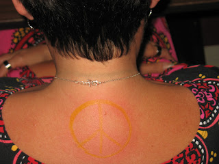
Actually, I found peace with
Wendy.

Or let's say...

...ON Wendy.

I actually know Wendy from high school,
but really only got this friendship
going on this trip.

Simply put, Wendy has peace signs
ALL over her house...

...And I felt she needed one all over her
neck.
Thank you Mary Anne,
and Thank you Wendy, For allowing sessions of
The Human Canvas to continue...
At The Apple.
That's The Big Apple Cafe in Murray,
Kentucky.
You should stop in some time.

THIS...
Was the
end of the evening.
Or a bit
into the morning, if ya look at that clock
on the wall in the background.
on the wall in the background.

But let's
step back a bit.
While in
Kentucky at the end of September,
I agreed
to do an art presentation/art lesson for a
Girl
Scout troop. I don't know exactly how I feel about
how I
did. I hope I can do it again next time I'm there.
I know
that I could do better. Meantime, I hope some
of the
kids this time got SOMETHING out of it.
Speaking
of which,
after the
presentation, and
after
some of the youngest of the young had
gone home with their parents, Marci (you've
seen her on these pages before. Click HERE for
some of the youngest of the young had
gone home with their parents, Marci (you've
seen her on these pages before. Click HERE for
a
link), explained
to a few of the remaining
kids
(and a
parent or two) that I also
sometimes
drew on people -
instead
of paper.
There was
a short line soon.

Again,
flowers on my mind, there were a couple of
these
done in the next couple of minutes.
done in the next couple of minutes.

so the
flowers seemed to fit.

Or a
clover.
Or ballet slippers.
Or ballet slippers.

This
kid
wanted a dragon though.

wanted a dragon though.

And why
not? I do regret not thowing
a bit of
grey in there. He wanted a black dragon.
I gave
him a quick outline. I think, though, that this
dragon
may have planted a seed for one I'd end up
doing in
the near future. One that I REALLY loved.
After dinner,
and a Murray State University
production of The Woman in Black,
I went back to Marci's for a couple more pieces.
Well, a few more. Marci's daughter Madison got one more flower similar to the ones earlier at the Girl Scout event.
After dinner,
and a Murray State University
production of The Woman in Black,
I went back to Marci's for a couple more pieces.
Well, a few more. Marci's daughter Madison got one more flower similar to the ones earlier at the Girl Scout event.

This one got
just a bit more attention to detail,
and I begrudgingly got a smile from
her.

On then... to Heather!

I had designed a piece
for another friend named Heather,
but it may be a bit before we get together for
me to start drawing on her.
Actually, I have yet to even ask.
It would be some vines with heather,
intertwined with a crown.

But again,
I have yet to even tell her
I've designed something for her.
Maybe she'll see this. Maybe one of her friends
will, and tell her about the
idea.

But back to this night.
A buncha little leaves
later...

Heather
on Heather.


Look at the clock below.
Right around 2:36 AM, if I read it correctly.
Anyway - Heather and Marci.
Thank you both!


Now...
Onto Marci!

Quite frankly,
I had come over with
the intention of putting a buncha
flowers on one side...

Do a similar piece on her other
side...

Then something large,
Occupying most of her back.
But I couldn't. I just couldn't.
I mean...

Look at the clock below.
Right around 2:36 AM, if I read it correctly.
Anyway - Heather and Marci.
Thank you both!

And, of course, thanks for lettin' me
draw on YOU next!
Meantime,
you can ALWAYS catch
the beginnings of all these Human Canvas
adventures through a couple of tabs nears the top
of the page "The Human Canvas - the beginning",
and "The human Canvas 2011".