Now THIS entry
is simply a combination of
the previous two, which really
should BE viewed together.
As soon as I publish
another session or two, it'll be awkward to
follow - in order - the two (connected) sessions
with Michelle. For that matter, as soon AS I published
part two (More Mixing and Matching Michelle),
they appeared out of order.
So here ya go.
Michelle.
I'd done a bit of filming for her, and was
rewarded with a canvas to work on. I've known her for
a while, and I guess I'd been leering long enough, as
she offered it up before I could ask.
I mean. I was certainly gonna, but she was
quicker on the draw.
As it were.
I've been working
on a design to connect my wife's
two tattoos into one, so THIS session
was gonna be a treat for me. Michelle already
had a couple of Chinese characters on her neck,
and an Egyptian theme running across the top of her back.
Across the small of her back - a bunch of wonderfully
colored flowers.
I got to fill in the space between.
I had kind of forgotten exactly what her
upper back design was, only a vague shape. So I started thinking about a Thunder bird.
I told her, and she said that was something
she'd been thinking about as well.
So it was settled.
Well, it WAS settled.
Then I started worrying about mixing a
Native American piece in with
the others.
I finally decided that with
Chinese, Egyptian, and the flowers
(which I felt had a Polynesian feel), I was safe
to venture into yet another culture. Mixing and matching on Michelle would work out fine.
Besides, a
thunder bird would go with the rest in other
ways, mirroring in shape...
...And in color as well.
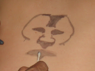
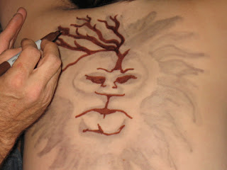
Now it's just a matter of playing with
those smears and blends. And there are extra
photos on this session for the whole step-by step thing.
It makes for a decent slideshow.
A little blurred and outside the edges...
but that truly doesn't matter - straying slightly
outside of your borders. At least in areas
where you're gonna go re-define
the edges with black
anyway.
Still though, I have a few ideas on how to control the smear/blend just a bit.
That'll come soon.
Meantime...
A cotton swab does the trick.
Nicely. A tip though. Buy generic.
Beyond generic. Buy something really really cheap.
Q-Tips have a wonderful, full, fluffy tip - great
for what they're actually
MADE for...
But when ya dip 'em in alcohol and drag 'em across the skin, they start to spread out... sometimes giving less of a smear/blend, and more of a general wash...
...That you have to
disguise with a buncha little circles.
Oh well. Looks good. Works well for that type of art.
Ya don't make mistakes. You make happy
little discoveries.
Now the thing with Sharpies,
is that upon application, they WILL stand out
from a real tattoo. No matter how good (or not) the
Sharpie drawing may be. The trick to avoiding this - is powdering it. Just like if you had just put on
makeup, and were trying
to avoid shine.
Um, I didn't have any.
Michelle asked, "Do you have any corn starch?"
Now that I reflect back on this day, I wonder if she might
have been kidding. Didn't matter at that point.
I was OFF to the kitchen.
BOOM!
Um, I didn't have any corn starch either.
All I could find was some instant gravy kinda
thickener kinda powder
kinda stuff.
Being the person who suggested
corn starch in the first place, Michelle was
okay with this being sprinkled on her. And the stuff spreads okay, but doesn't do too much for taking off that shine.
It just sorta sweeps off, leaving
white powder along the edges of your backdrop.
Uh - and the cat.
So - this thunderbird remained a bit more vivid
than the other tattoos..
Now the thing is, even without washing,
these things will fade slowly anyway. Well, technically
speaking, they're not actually fading, but rather,
the skin is slowly flaking away. So the next day,
these things are always muted, having the
vibrancy of something more
akin to a real tattoo.
Problem is, with the fading of color,
you get a fading of detail. I always wanted to go
back into one of these things, the day after,
but never pursued the chance.
Until now.
So - this next shot is what it looked like after a
night of sleep - some of it onto a black t-shirt, some
onto the sheets - fair warning
having been given.
So with just a quick touch-up of the purple...
...And the red and yellow wing-tips,
and that's pretty much matched up with the
vibrancy of the original tattoos. At least for a zoomed
out shot like this one.
Problem is - with the fading of color,
you also get degradation of detail. And when
you go in with the black to replace it, the color is
once again too bold to match up with the
original tattoos - which was part of
the POINT of this session.
But there IS a way around that. We'll address that shortly.
Meantime, in addition to the Thunder bird,
she was game for letting me add a
drawn flower to the
tattooed ones.
Well, three.
Okay - Six.
Now once again, while the flowers
turned OUT well, they were - like the Thunder bird -
now more bold than the
real tattoos.
but ya take this, and ya powder it down...
(ordinary setting powder)
And everything now has the same TONE,
And ready for a few nice shots.
Only thing - a couple lines on the
Thunder bird ended up crooked. There was
SOMEthing keeping me from straightening them,
without the line getting thicker
and thicker.
Also, I coulda extended some of the
dark lines of the drawn flowers into the areas
of the tattooed ones.
Just a bit.
It's okay though we were both
quite happy with the results of this
session - and there'll be another in the future.
This is one of several in the works that have to do with adaptation with a real tattoo.
But I also had to dash.
Believe it or not, I had another session
lined up for that night (which turned out to be two),
and so I ran off after finishing this, bemoaning
that I wasn't allowing myself just
another 20 minutes (or so).
But what I ran off to do
became something REALLY cool.
That'll be published next.
I also JUST got through doing
fourteen pieces during a music festival for
autism awareness and education. That'll be
coming soon as well, so please,
check back.
But thanks for coming by this time around.
And you can follow the whole Human canvas story through a few tabs near the top of this page.


